


Lavadora Challenger automática de carga superior de 15 Kg (33 Lb) – CW 5715 DG
$418.63 Incluye IVA
Descubre la lavadora automática CW 5715 DG con capacidad de 15 kg. Su sistema One Touch ofrece un lavado inteligente, mientras que el diseño anti-enredos y el tambor de acero inoxidable garantizan el cuidado de tu ropa. Perfecta para un lavado eficiente y seguro.
@charset «UTF-8»;
/*————————————*\
Estilos theme Challenger
2023
Autor: Aguayo
\*————————————*/
/**
* Variable ruta imágenes incluidas en los CSS | use: url(# {$path-img}/card-shadow.svg)
* @nuclide Variables
* @section Settings > Path
*/
/**
* Variable ruta a la carpeta de fuentes | use: url(‘# {$path-font}/# {$font-family-ico}.woff?’)
* @nuclide Variables
* @section Settings > Path
*/
/**
* Base HTML: 16px
* @nuclide Variables
* @section Settings > Font size
*/
/**
* Font family: ‘Outfit’
* @nuclide Variables
* @section Settings > Font family
*/
/**
* font-weight: Regular | Font family: Outfit
* @nuclide Variables
* @section Settings > Font weight
*/
/**
* font-weight: Medium | Font family: Outfit
* @nuclide Variables
* @section Settings > Font weight
*/
/**
* font-weight: Semi Bold | Font family: Outfit
* @nuclide Variables
* @section Settings > Font weight
*/
/**
* Font family: fuentes de ícono
* @nuclide Variables
* @section Settings > Font family
*/
/**
* Unidad mínima la retícula digital es 8,
* el sistema de reticula se basa en incrementos verticales y horizontales de 8 píxeles.
* Uso: multiplicar la variable por el número del incremento deseado. Ejemplo: $gutter * 2
* @nuclide Variables
* @section Settings > Gutter
*/
/**
* $canvas-with: Ancho del canvas en porcentajes
* @nuclide Variables
* @section Settings > Canvas
*/
/**
* $canvas-max-with: Máximo Ancho del canvas en pixeles,
* Grid 4 columnas: 240px,
* Grid 3 columnas: 320px,
* Grid 2 columnas: 480px
* @nuclide Variables
* @section Settings > Canvas
*/
/**
* Small
* @nuclide Variables
* @section Settings > Breakpoint predefinidos
*/
/**
* small-m
* @nuclide Variables
* @section Settings > Breakpoint predefinidos
*/
/**
* medium
* @nuclide Variables
* @section Settings > Breakpoint predefinidos
*/
/**
* wide
* @nuclide Variables
* @section Settings > Breakpoint predefinidos
*/
/**
* large
* @nuclide Variables
* @section Settings > Breakpoint predefinidos
*/
/**
* big
* @nuclide Variables
* @section Settings > Breakpoint predefinidos
*/
/**
* huge
* @nuclide Variables
* @section Settings > Breakpoint predefinidos
*/
/**
* $canvas-with: Transición para animaciones de elementos
* @nuclide Variables
* @section Settings > Transition
*/
/**
* Flexbox Containers display: flex. Utiliza el soporte nativo de los navegadores.
* The ‘flex’ value causes an element to generate a block-level flex container box.
* http://w3.org/tr/css3-flexbox/#flex-containers
* @mixin
* @section Flexbox prefix
* @example
* .foo {
* @include flexbox;
* }
*/
@import url(«https://fonts.googleapis.com/css2?family=Montserrat:wght@400;700;900&display=swap»);
/**
* Flexbox Containers display: inline-flex. Utiliza el soporte nativo de los navegadores.
* The ‘inline-flex’ value causes an element to generate a inline-level flex container box.
* http://w3.org/tr/css3-flexbox/#flex-containers
* @mixin
* @section Flexbox prefix
* @example
* .foo {
* @include inline-flex;
* }
*/
/**
* Flexbox Direction.
* The ‘flex-direction’ property specifies how flex items are placed in
* the flex container, by setting the direction of the flex container’s main axis.
* This determines the direction that flex items are laid out in.
* http://w3.org/tr/css3-flexbox/#flex-direction-property
* @mixin
* @section Flexbox prefix
* @param $value
* Default: row ♣
* Values: row | row-reverse | column | column-reverse
* @example
* .foo {
* @include flex-direction(column);
* }
*/
/**
* Flexbox Wrap.
* The ‘flex-wrap’ property controls whether the flex container is single-line
* or multi-line, and the direction of the cross-axis, which determines
* the direction new lines are stacked in.
* No Webkit Box fallback.
* http://w3.org/tr/css3-flexbox/#flex-wrap-property
* @mixin
* @section Flexbox prefix
* @param $value
* Default: nowrap ♣
* Values: nowrap | wrap | wrap-reverse
* @example
* .foo {
* @include flex-wrap(wrap);
* }
*/
/**
* Flexbox Flow (shorthand).
* The ‘flex-flow’ property is a shorthand for setting the ‘flex-direction’
* and ‘flex-wrap’ properties, which together define the flex container’s
* main and cross axes.
* No Webkit Box fallback.
* http://w3.org/tr/css3-flexbox/#flex-flow-property
* @mixin
* @section Flexbox prefix
* @param $values
* Default: row nowrap ♣
* Values: [flex-direction: row | row-reverse | column | column-reverse] | [flex-wrap: nowrap | wrap | wrap-reverse]
* @example
* .foo {
* @include flex-flow(column nowrap);
* }
*/
/**
* Flexbox Order.
* The ‘order’ property controls the order in which flex items appear within
* their flex container, by assigning them to ordinal groups.
* http://w3.org/tr/css3-flexbox/#order-property
* @mixin
* @section Flexbox prefix
* @param $int
* Default: 0
* @example
* .foo {
* @include order(1);
* }
*/
/**
* Flexbox Grow.
* The ‘flex-grow’ property sets the flex grow factor. Negative numbers are invalid.
* http://w3.org/tr/css3-flexbox/#flex-grow-property
* @mixin
* @section Flexbox prefix
* @param $int
* Default: 0
* @example
* .foo {
* @include flex-grow(1);
* }
*/
/**
* Flexbox Shrink.
* The ‘flex-shrink’ property sets the flex shrink factor. Negative numbers are invalid.
* http://w3.org/tr/css3-flexbox/#flex-shrink-property
* @mixin
* @section Flexbox prefix
* @param $int
* Default: 1
* @example
* .foo {
* @include flex-grow(1);
* }
*/
/**
* Flexbox Basis.
* The ‘flex-basis’ property sets the flex basis. Negative lengths are invalid.
* http://www.w3.org/TR/css3-flexbox/#flex-basis-property
* @mixin
* @section Flexbox prefix
* @param $value
* Default: auto ♣
* Values: Like «width»
* @example
* .foo {
* @include flex-basis(50%);
* }
*/
/**
* Flexbox «Flex» (shorthand).
* The ‘flex’ property specifies the components of a flexible length: the
* flex grow factor and flex shrink factor, and the flex basis. When an
* element is a flex item, ‘flex’ is consulted instead of the main size
* property to determine the main size of the element. If an element is
* not a flex item, ‘flex’ has no effect.
* http://w3.org/tr/css3-flexbox/#flex-property
* @mixin
* @section Flexbox prefix
* @param $fg
* Default: See individual properties (1 1 0). ♣
* Values: none |
* @param $fs
* Default: See individual properties (1 1 0). ♣
* Values: none |
* @param $fb
* Default: See individual properties (1 1 0). ♣
* Values: none |
* @example
* .foo {
* @include flex( 1 1 50%);
* }
*/
/**
* Flexbox Justify Content.
* The ‘justify-content’ property aligns flex items along the main axis
* of the current line of the flex container. This is done after any flexible
* lengths and any auto margins have been resolved. Typically it helps distribute
* extra free space leftover when either all the flex items on a line are
* inflexible, or are flexible but have reached their maximum size. It also
* exerts some control over the alignment of items when they overflow the line.
* Note: ‘space-*’ values not supported in older syntaxes.
* http://w3.org/tr/css3-flexbox/#justify-content-property
* @mixin
* @section Flexbox prefix
* @param $value
* Default: flex-start ♣
* Values: flex-start | flex-end | center | space-between | space-around
* @example
* .foo {
* @include justify-content(space-between);
* }
*/
/**
* Flexbox Align Items.
* Flex items can be aligned in the cross axis of the current line of the
* flex container, similar to ‘justify-content’ but in the perpendicular
* direction. ‘align-items’ sets the default alignment for all of the flex
* container’s items, including anonymous flex items. ‘align-self’ allows
* this default alignment to be overridden for individual flex items. (For
* anonymous flex items, ‘align-self’ always matches the value of ‘align-items’
* on their associated flex container.)
* http://w3.org/tr/css3-flexbox/#align-items-property
* @mixin
* @section Flexbox prefix
* @param $value
* Default: stretch ♣
* Values: flex-start | flex-end | center | baseline | stretch
* @example
* .foo {
* @include align-items(space-between);
* }
*/
/**
* Flexbox Align Self.
* https://www.w3.org/TR/css-flexbox-1/#propdef-align-self
* @mixin
* @section Flexbox prefix
* @param $value
* Default: auto ♣
* Values: auto | flex-start | flex-end | center | baseline | stretch
* @example
* .foo {
* @include align-self(flex-end);
* }
*/
/**
* Flexbox Align Content.
* The ‘align-content’ property aligns a flex container’s lines within the
* flex container when there is extra space in the cross-axis, similar to
* how ‘justify-content’ aligns individual items within the main-axis. Note,
* this property has no effect when the flexbox has only a single line.
* http://w3.org/tr/css3-flexbox/#align-content-property
* @mixin
* @section Flexbox prefix
* @param $value
* Default: stretch ♣
* Values: flex-start | flex-end | center | space-between | space-around | stretch
* @example
* .foo {
* @include align-content(flex-end);
* }
*/
/**
* Convertir valor de (px) a (rem) de cualquier propiedad, agrega fallback en px para navegadores antiguos.
*
* @mixin
* @section Utils
* @param $property Propiedad css, ej. margin, max-width, etc..
* @param $values Valor en px
* @example
* .foo {
* @include px-to-rem(padding, 20px 10px);
* }
*/
/**
* Incluye Font-family propiedades fuente de iconos para pseudo elementos.
* @mixin
* @section Utils
* @param $font-family Variable Font-family
* @example
* .foo {
* Propiedades…
* &:before {
* @include font-family-ico($font-family-ico);
* }
* }
*/
/**
* keyframes mixin para animaciones CSS
*
* @mixin
* @section Utils
* @param $animation-name Nombre que indica un @keyframes, esta regla define los valores de las propiedades de la secuencia de animación.
* @param animation-name Propiedad CSS que especifica las animaciones aplicadas al elemento seleccionado. Cada nombre indica un @keyframes.
* @example
* @include keyframes(slideIn) {
* from {
* margin-left: 100%;
* width: 300%
* }
* to {
* margin-left: 0%;
* width: 100%;
* }
* }
* //- La propiedad CSS animation-name especifica una lista de animaciones que se deben aplicar al elemento seleccionado.
* .ag-animation-slidein {
* animation-name: slideIn;
* animation-duration: 3s;
* animation-iteration-count: 3;
* animation-direction: alternate;
* ….
* }
*/
/**
* Full query: Mediaquerys predefinidos, para el proyecto.
* Disponibles para 10 screen sizes diferentes.
* Para modificarlos, editar las variables definidas en los breakpoints.
*
* @mixin
* @section Utils
* @param $breakpoint-value
* ♣ Breakpoint min-width
* small: 375px | small-m: 480px | medium: 768px | wide: 1024px | big: 1280px | huge: 1440px | large: 1180px
* ♣ Breakpoint max-width
* medium-max: 0 – 767px | wide-max : 0 – 1023px | large-max : 0 – 1179px
*
* @example
* || small: breakpoint min-width: 375px –> $bp-small
* @include media-query(small) {
* PROPERTIES…
* }
* || small-m: breakpoint min-width 540px –> $bp-small-m
* @include media-query(small-m) {
* PROPERTIES…
* }
* || medium: breakpoint min-width 768px –> $bp-medium
* @include media-query(medium) {
* PROPERTIES…
* }
* || medium-max: breakpoint max-width 0 – 767px
* @include media-query(medium-max) {
* PROPERTIES…
* }
* || wide: breakpoint min-width 1024px –> $bp-wide
* @include media-query(wide) {
* PROPERTIES…
* }
* || wide-max: breakpoint max-width 0 – 1023px
* @include media-query(wide-max) {
* PROPERTIES…
* }
* || large: breakpoint min-width 1180px –> $bp-large
* @include media-query(large) {
* PROPERTIES…
* }
* || huge: breakpoint min-width 1440px –> $bp-huge
* @include media-query(huge) {
* PROPERTIES…
* }
* || huge-max: breakpoint max-width 0 – 1440px –> $bp-huge
* @include media-query(huge-max) {
* PROPERTIES…
* }
* || large-max: breakpoint max-width 0 – 1179px
* @include media-query(large-max) {
* PROPERTIES…
* }
* || big: breakpoint min-width 1280px –> $bp-big
* @include media-query(big) {
* PROPERTIES…
* }
*/
/**
* Helper para insertar fácilmente mediaquery a un selector específico.
*
* @mixin
* @section Helpers
* @param $breakpoint-value
* ♣ Breakpoint min-width
* 【 small: 375px | small-m: 480px | medium: 768px | wide: 1024px | big: 1280px | huge: 1440px | large: 1180px 】
* ♣ Breakpoint max-width
* 【 medium-max: 0 – 767px | wide-max : 0 – 1023px | large-max : 0 – 1179px 】
* @example
* .foo {
* PROPERTIES…
* @include media-query-help(small) {
* PROPERTIES…
* }
* }
* || Variables
* ♣ small : breakpoint min-width 375px
* ♣ medium : breakpoint min-width 768px
* ♣ medium-max: breakpoint max-width 0 – 767px
* ♣ wide : breakpoint min-width 1024px
* ♣ wide-max : breakpoint max-width 0 – 1023px
* ♣ large : breakpoint min-width 1180px
* ♣ huge : breakpoint min-width 1440px
* ♣ large-max : breakpoint max-width 0 – 1179px
* ♣ big : breakpoint min-width 1280px
*/
/**
* Center-translate: Centra horizontalmente o verticalmente un elemento en su contexto. Translación en un solo eje.
*
* @mixin
* @section Helpers
* @param $axis
* Valor eje translate
* ♣ Default: translateX
* ♣ Values: translateX | translateY
* @example
* .foo {
* @include center-translate(translateY)
* }
* || El @include se traducirá en:
* .foo {
* display: block;
* position: relative;
* top: 50%;
* -ms-transform : translateY(-50%);
* -moz-transform : translateY(-50%);
* -o-transform : translateY(-50%);
* -webkit-transform: translateY(-50%);
* transform : translateY(-50%);
* }
*/
/**
* Centra horizontalmente o verticalmente un elemento en su contexto. Translación en un solo eje.
*
* @mixin
* @section Helpers
* @param $justify
* Default: center ♣
* Values: center | flex-start | flex-end | space-between | space-around
* @param $align
* Default: center ♣
* Values: center | flex-start | flex-end | baseline | stretch
* @example
* .foo {
* @include center-flexbox;
* }
* || El @include se traducirá en:
* .foo {
* display: flex;
* justify-content: center;
* align-items : center;
* }
* .foo {
* @include center-flexbox(space-between)
* }
* || El @include se traducirá en:
* .foo {
* display: flex;
* justify-content: space-between;
* align-items : center;
* }
* .foo {
* @include center-flexbox(center, flex-start)
* }
* || El @include se traducirá en:
* .foo {
* display: flex;
* justify-content: center;
* align-items : flex-start;
* }
*/
/**
* Borra la flotación de los elementos.
*
* @mixin
* @section Helpers
* @example
* .foo {
* @include clearfix;
* }
* || El @include se traducirá en:
* .foo:after {
* content: »;
* display: table;
* clear: both;
* }
*/
/**
* Aplica overflow ellipsis multiples lineas de texto.
* Adición de CSS a un elemento que limitará la visibilidad del texto después de cierto punto.
* La altura máxima en rem se calcula multiplicando:
* (font-size) * (line-heigth) * (número de líneas que se quiera mostrar)
*
* @mixin
* @section Helpers
* @param $font-size Valor tamaño de fuente en px.
* @param $line-height Valor Alto de linea.
* @param $lines Número de lineas a mostrar.
* @example
* .foo {
* @include truncatechars(16px, 1.4, 3)
* }
* || El @include se traducirá en:
* .foo {
* display: block;
* display: -webkit-box;
* max-height: 67.2px;
* max-height: 4.2rem;
* overflow: hidden;
* line-height: 1.4;
* -webkit-line-clamp: 3;
* -webkit-box-orient: vertical;
* text-overflow: ellipsis;
* font-size: 16px;
* font-size: 1rem;
* }
*/
/**
* Aplica overflow ellipsis multiples lineas de texto.
* Adición de CSS a un elemento que limitará la visibilidad del texto después de cierto punto.
* La altura máxima en rem se calcula multiplicando:
* (font-size) * (line-heigth) * (número de líneas que se quiera mostrar)
*
* @mixin
* @section Helpers
* @param $font-size Valor tamaño de fuente en px.
* @param $line-height Valor Alto de linea.
* @param $lines Número de lineas a mostrar.
* @example
* .foo {
* @include truncatechars-change(16px, 1.4, 3)
* }
* || Debe agregar font-size y line-height. El @include se traducirá en:
* .foo {
* max-height: 67.2px;
* max-height: 4.2rem;
* }
*/
/**
* Offset: compensa el ancho de su contenedor para que el elemento ocupe el 100% del ancho del viewport
* ♣ Resta al 100% el ancho del canvas,
* ♣ el padding se puede ajustar a la necesidad del diseño
* ♣ Se recomienda usar las variables: _var-canvas
*
* @mixin
* @section Helpers
* @param $canvasWidth Valor ancho del canvas.
* @param $elementPadding Valor del padding left y right
* @example
* || Si usa variables prestablecidad para el ancho del canvas.
* || para este ejemplo $canvas-with equivale a 90%.
* .foo {
* @include offset-full(‘$canvas-with’, 4%);
* }
* || Si usa un valor en prcentajes no registrado: debe ser igual al valor del ancho de su contenedor
* .foo {
* @include offset-full(90%, 4%);
* }
* || El @include se traducirá en:
* .foo {
* margin-left: -5%;
* margin-right: -5%;
* padding-left: 4%;
* padding-right: 4%;
* }
*/
body,
h1, h2, h3, h4, h5, h6,
dl, dd, ol, ul {
margin: 0;
padding: 0;
}
html {
font-size: 16px;
line-height: 1.15;
-ms-text-size-adjust: 100%;
-webkit-text-size-adjust: 100%;
}
body * {
box-sizing: border-box;
}
article,
aside,
footer,
header,
nav,
section {
display: block;
}
h1 {
font-size: 2em;
}
figcaption,
figure,
main {
display: block;
}
figure,
p {
margin: 0;
}
hr {
box-sizing: content-box;
height: 0;
overflow: visible;
}
a {
background-color: transparent;
-webkit-text-decoration-skip: objects;
}
a:active, a:hover {
outline-width: 0;
}
abbr[title] {
border-bottom: none;
text-decoration: underline;
text-decoration: underline dotted;
}
abbr[title],
dfn[title] {
cursor: help;
}
b,
strong {
font-weight: inherit;
font-weight: bolder;
}
code,
pre,
kbd,
samp {
font-family: monospace, monospace;
font-size: 1em;
}
dfn {
font-style: italic;
}
mark {
background-color: #ff0;
color: #000;
}
small {
font-size: 80%;
}
sub,
sup {
font-size: 75%;
line-height: 0;
position: relative;
vertical-align: baseline;
}
sub {
bottom: -0.25em;
}
sup {
top: -0.5em;
}
blockquote {
margin: 0;
}
audio,
video {
display: inline-block;
vertical-align: baseline;
}
audio:not([controls]) {
display: none;
height: 0;
}
img {
border-style: none;
vertical-align: bottom;
max-width: 100%;
height: auto;
}
svg:not(:root) {
overflow: hidden;
}
input {
line-height: normal;
}
button,
input,
optgroup,
select,
textarea {
font-family: sans-serif;
font-size: 100%;
line-height: 1.15;
margin: 0;
}
button,
input {
overflow: visible;
}
button,
select {
text-transform: none;
}
button {
background-color: transparent;
}
optgroup {
font-weight: bold;
}
button,
html [type=button],
[type=reset],
[type=submit] {
-webkit-appearance: button;
cursor: pointer;
}
button::-moz-focus-inner,
[type=button]::-moz-focus-inner,
[type=reset]::-moz-focus-inner,
[type=submit]::-moz-focus-inner {
border-style: none;
padding: 0;
}
button:-moz-focusring,
[type=button]:-moz-focusring,
[type=reset]:-moz-focusring,
[type=submit]:-moz-focusring {
outline: 1px dotted ButtonText;
}
input[type=number]::-webkit-inner-spin-button,
input[type=number]::-webkit-outer-spin-button {
height: auto;
}
fieldset {
margin: 0 2px;
padding: 0.35em 0.75em 0.625em;
}
legend {
box-sizing: border-box;
color: inherit;
display: table;
max-width: 100%;
padding: 0;
white-space: normal;
border: 0;
}
progress {
display: inline-block;
vertical-align: baseline;
}
textarea {
overflow: auto;
}
[type=checkbox],
[type=radio] {
box-sizing: border-box;
padding: 0;
}
[type=number]::-webkit-inner-spin-button,
[type=number]::-webkit-outer-spin-button {
height: auto;
}
[type=search] {
-webkit-appearance: textfield;
outline-offset: -2px;
}
[type=search]::-webkit-search-cancel-button,
[type=search]::-webkit-search-decoration {
-webkit-appearance: none;
}
::-webkit-file-upload-button {
-webkit-appearance: button;
font: inherit;
}
table {
border-collapse: collapse;
border-spacing: 0;
}
td, th {
padding: 0;
}
details,
menu {
display: block;
}
summary {
display: list-item;
}
canvas {
display: inline-block;
}
template {
display: none;
}
[hidden] {
display: none;
}
/*———————————————*\
#font-face
$font-family-ico: «ico-chl-fee-product» !default;
URL custom fonts: https://fonts.google.com/share?selection.family=Outfit:wght@400;500;600
\*———————————————*/
.ag-o-canvas {
width: 95%;
max-width: 1190px;
max-width: 74.375rem;
margin-left: auto;
margin-right: auto;
}
html {
scroll-behavior: smooth;
-webkit-overflow-scrolling: touch;
}
body {
background-color: #fff;
}
.ag-o-surface_bg,
.ag-o-surface_dark {
color: #fff;
}
.ag-o-surface_bg {
background-size: cover;
background-position: center;
background-repeat: no-repeat;
}
.ag-o-surface_light {
background-color: #F2F2F2;
}
.ag-o-surface_dark {
background-color: #000000;
}
@media only screen and (max-width: 767px) {
.ag-o-section,
.ag-o-surface {
padding: 16px 0;
}
.ag-o-surface_bg {
max-height: 800px;
min-height: 800px;
}
.ag-o-surface-txt-bg {
margin-bottom: 8px;
padding-top: 0;
}
.ag-o-surface-txt-bg__canvas {
width: 100%;
background-color: #000000;
padding: 24px 24px 32px;
}
}
@media (min-width: 768px) and (max-width: 1200px) {
.ag-o-section,
.ag-o-surface {
padding: 40px 0;
}
.ag-o-surface_bg {
max-height: 670px;
min-height: 670px;
}
}
@media only screen and (min-width: 1201px) {
.ag-o-section,
.ag-o-surface {
padding: 64px 0;
}
.ag-o-surface_bg {
max-height: 1080px;
min-height: 1080px;
}
}
h1,
h2,
h3,
h4,
h5,
h6 {
font-family: «Montserrat», sans-serif;
font-weight: 400;
line-height: 1.2;
color: inherit;
}
.ag-o-kicker {
letter-spacing: 1.12px;
}
.ag-o-kicker_yellow {
color: #F6CA44;
}
.ag-o-kicker_orange {
color: #F08200;
}
.ag-o-kicker_primary30 {
color: #11A3DE;
}
.ag-o-kicker_green10 {
color: #93A718;
}
.ag-o-headline {
max-width: 600px;
margin: 0 auto;
text-align: center;
}
.ag-o-headline .ag-o-title {
margin-bottom: 16px;
}
.ag-o-headline_w900 {
max-width: 900px;
}
@media (max-width: 767px) {
.ag-o-headline_left {
text-align: left;
margin: 0;
}
.ag-o-headline_left-padding {
padding: 24px 24px 32px;
text-align: left;
}
}
@media (max-width: 768px) {
.ag-o-kicker {
font-size: 14px;
}
}
@media only screen and (max-width: 1199px) {
.ag-o-title {
font-size: 32px;
font-size: 2rem;
}
.ag-o-subtitle {
font-size: 24px;
}
}
@media only screen and (min-width: 1200px) {
.ag-o-title {
font-size: 48px;
font-size: 3rem;
}
.ag-o-subtitle {
font-size: 36px;
}
}
html,
.theme {
color: #151515;
font-size: 100%;
}
body,
.ag-o-text {
line-height: 1.8;
color: inherit;
font-family: «Montserrat», sans-serif;
font-weight: 400;
font-size: 16px;
font-size: 1rem;
}
.ag-o-text_neutro {
color: #fff;
}
.ag-o-text_primary-40 {
color: #00A4D0;
}
.ag-o-bold {
font-weight: 700;
}
@media (min-width: 801px) {
.ag-o-text {
font-size: 18px;
font-size: 1.125rem;
}
}
.ag-o-box-copy {
display: block;
width: fit-content;
padding-bottom: 7px;
padding-bottom: 0.4375rem;
padding-top: 7px;
padding-top: 0.4375rem;
padding-left: 16px;
padding-left: 1rem;
padding-right: 16px;
padding-right: 1rem;
background-color: #E3F3FD;
font-size: 16px;
font-size: 1rem;
font-weight: 600;
color: #151515;
}
.ag-o-box-copy_margin-top {
margin-top: 16px;
margin-top: 1rem;
}
.ag-o-box-copy_margin-bottom {
margin-bottom: 56px;
margin-bottom: 3.5rem;
}
.ag-o-box-copy__yellow {
color: #151515;
background-color: #F6CA44;
}
.ag-o-box-copy__dark {
color: #fff;
background-color: #0B111F;
}
@media only screen and (min-width: 768px) {
.ag-o-box-copy {
padding-bottom: 10px;
padding-bottom: 0.625rem;
padding-bottom: 10px;
padding-bottom: 0.625rem;
font-size: 24px;
font-size: 1.5rem;
}
}
.ag-o-img {
width: 100%;
}
.ag-o-list {
max-width: 620px;
max-width: 38.75rem;
}
.ag-o-list__item {
display: -webkit-box;
display: -webkit-flex;
display: -moz-box;
display: -ms-flexbox;
display: flex;
-webkit-box-direction: normal;
-webkit-box-orient: vertical;
-webkit-flex-direction: column;
-moz-flex-direction: column;
-ms-flex-direction: column;
flex-direction: column;
text-align: center;
row-gap: 16px;
row-gap: 1rem;
-webkit-box-align: center;
-ms-flex-align: center;
-webkit-align-items: center;
-moz-align-items: center;
align-items: center;
margin-bottom: 32px;
margin-bottom: 2rem;
}
.ag-o-list__img {
max-width: fit-content;
max-width: 35px;
max-width: 2.1875rem;
}
.ag-o-list__img_margin {
margin-top: 32px;
margin-top: 2rem;
}
.ag-o-list__text {
font-weight: 600;
}
.ag-o-list__item_align-left {
-webkit-box-direction: normal;
-webkit-box-orient: horizontal;
-webkit-flex-direction: row;
-moz-flex-direction: row;
-ms-flex-direction: row;
flex-direction: row;
column-gap: 16px;
column-gap: 1rem;
text-align: left;
}
@media only screen and (min-width: 768px) {
.ag-o-list__item {
flex-direction: row;
column-gap: 16px;
column-gap: 1rem;
}
.ag-o-list__text {
font-size: 19px;
font-size: 1.1875rem;
text-align: left;
}
}
.ag-o-bullet {
position: relative;
display: -webkit-box;
display: -webkit-flex;
display: -moz-box;
display: -ms-flexbox;
display: flex;
-webkit-box-pack: center;
-ms-flex-pack: center;
-webkit-justify-content: center;
-moz-justify-content: center;
justify-content: center;
-webkit-box-align: center;
-ms-flex-align: center;
-webkit-align-items: center;
-moz-align-items: center;
align-items: center;
color: #fff;
border: 2px solid #fff;
border-radius: 100%;
margin-bottom: 24px;
margin-bottom: 1.5rem;
width: 64px;
width: 4rem;
min-width: 64px;
min-width: 4rem;
min-height: 64px;
min-height: 4rem;
font-size: 33px;
font-size: 2.0625rem;
}
.ag-o-bullet::after {
content: «»;
position: absolute;
height: 2px;
width: 63vw;
right: 0;
left: 124px;
background-color: #0B111F;
}
.ag-o-bullet_dark {
color: #0B111F;
border-color: #0B111F;
}
.ag-o-bullet_line-none::after {
display: none;
}
@media only screen and (min-width: 768px) {
.ag-o-header-bullet {
display: -webkit-box;
display: -webkit-flex;
display: -moz-box;
display: -ms-flexbox;
display: flex;
column-gap: 56px;
column-gap: 3.5rem;
}
.ag-o-bullet {
order: 2;
width: 107px;
width: 6.6875rem;
height: 107px;
height: 6.6875rem;
min-width: 107px;
min-width: 6.6875rem;
min-height: 107px;
min-height: 6.6875rem;
font-size: 56px;
font-size: 3.5rem;
}
}
@media only screen and (max-width: 1200px) {
.ag-o-bullet::after {
display: none;
}
}
@media only screen and (min-width: 1200px) {
.ag-o-header-bullet {
-webkit-box-direction: normal;
-webkit-box-orient: vertical;
-webkit-flex-direction: column;
-moz-flex-direction: column;
-ms-flex-direction: column;
flex-direction: column;
}
.ag-o-bullet {
order: initial;
}
}
.ag-o-underline_light,
.ag-o-underline_dark {
max-width: 486px;
max-width: 30.375rem;
margin-top: 32px;
margin-top: 2rem;
padding-bottom: 24px;
padding-bottom: 1.5rem;
}
.ag-o-underline_light {
border-bottom: 1px solid #fff;
}
.ag-o-underline_dark {
border-bottom: 1px solid #151515;
}
@media only screen and (max-width: 767px) {
.ag-o-underline_light,
.ag-o-underline_dark {
border-bottom: none;
}
}
@media only screen and (min-width: 768px) {
.ag-o-underline_light,
.ag-o-underline_dark {
font-size: 20px;
font-size: 1.25rem;
}
.ag-o-underline_dark-bold {
font-size: 48px;
font-size: 3rem;
}
}
@media only screen and (min-width: 768px) and (max-width: 1199px) {
.ag-o-underline_absolute {
position: absolute;
right: 0;
bottom: 25%;
max-width: initial;
width: 54%;
}
}
.ag-o-caption-ico {
position: relative;
margin-top: 32px;
margin-top: 2rem;
padding-top: 32px;
padding-top: 2rem;
padding-right: 24px;
padding-right: 1.5rem;
padding-left: 24px;
padding-left: 1.5rem;
}
.ag-o-caption-ico::before {
content: «»;
position: absolute;
top: 0;
left: 0;
width: 100%;
height: 4px;
height: 0.25rem;
background: linear-gradient(270deg, #FB2A98 0%, #6CDDFF 100%);
}
.ag-o-caption-ico__content {
column-gap: 24px;
column-gap: 1.5rem;
max-width: 360px;
max-width: 22.5rem;
}
.ag-o-caption-ico__img {
max-width: 70px;
max-width: 4.375rem;
}
@media only screen and (max-width: 800px) {
.ag-o-caption-ico_dk {
display: none;
}
}
@media only screen and (min-width: 1200px) {
.ag-o-caption-ico_mb {
display: none;
}
}
@media only screen and (max-width: 1200px) {
.ag-o-caption-ico__content {
margin-right: auto;
margin-left: auto;
}
.ag-o-caption-ico_dk {
display: none;
}
}
/**
* Class: u-hidden, display none
* @atom Ocultar elemento
* @section Utils
* @markup
*
* Twitter
*
*/
.u-hidden {
display: none;
position: absolute;
top: 1000px;
right: 1000px;
opacity: 0;
visibility: hidden;
}
/**
* Class: u-inherit-color, Color de texto heredado del color especificado para el texto del bloque padre.
* @atom Color heredado
* @section Utils
* @markup
*
* Color de texto heredado
*
*/
.u-inherit-color {
color: inherit;
}
.u-blue-mark {
color: inherit;
}
.u-display-block {
display: block;
}
.u-position-relative {
position: relative;
}
/**
* Class: u-rounded, Le da un borde redondeado de 8px al elemento.
* @atom Borde redondeado
* @section Utils
* @markup
*
* Color de texto heredado
*
*/
.u-rounded {
border-radius: 8px;
border-radius: 0.5rem;
}
/**
* Class: u-hidden-mb, display none
* @atom Ocultar elemento en Mobile
* @section Utils
* @markup
*
* Twitter
*
*/
@media only screen and (max-width: 940px) {
.u-hidden-mb {
display: none;
}
}
/**
* Class: u-hidden-dk, display none
* @atom Ocultar elemento en Desktop
* @section Utils
* @markup
*
* Twitter
*
*/
@media only screen and (min-width: 940px) {
.u-hidden-dk {
display: none;
}
}
@media only screen and (min-width: 1200px) {
.u-padding-left-95 {
padding-left: 95px;
padding-left: 5.9375rem;
}
}
.ag-c-footer {
text-align: center;
padding-top: 56px;
padding-top: 3.5rem;
padding-bottom: 56px;
padding-bottom: 3.5rem;
}
.ag-c-footer__img {
max-width: 160px;
max-width: 10rem;
margin-bottom: 24px;
margin-bottom: 1.5rem;
}
.ag-c-footer__paragraph {
text-align: center;
margin-bottom: 24px;
margin-bottom: 1.5rem;
color: #F2F2F2;
font-size: 14px;
font-size: 0.875rem;
}
@media only screen and (min-width: 768px) {
.ag-c-footer__img {
max-width: 253px;
max-width: 15.8125rem;
}
.ag-c-footer__paragraph {
margin-bottom: 0;
font-size: 12px;
font-size: 0.75rem;
}
}
@media only screen and (min-width: 1200px) {
.ag-c-footer__img {
max-width: 341px;
max-width: 21.3125rem;
}
}
.ag-c-zig-zag-section_surface {
background-color: #F2F2F2;
}
.ag-c-zig-zag_bg {
background-color: #F2F2F2;
}
.ag-c-zig-zag__img {
height: 100%;
object-fit: cover;
object-position: left;
}
.ag-c-zig-zag__icon {
display: block;
max-width: 110px;
margin-top: 8px;
margin-bottom: 8px;
}
@media (max-width: 767px) {
.ag-c-zig-zag {
margin-top: 8px;
}
.ag-c-zig-zag__figure {
height: 360px;
}
.ag-c-zig-zag__header {
padding: 24px;
}
.ag-c-zig-zag__title {
margin: 8px 0;
}
}
@media (min-width: 768px) {
.ag-c-zig-zag {
display: flex;
flex-direction: row-reverse;
}
.ag-c-zig-zag.ag-c-zig-zag_right {
flex-direction: row;
}
.ag-c-zig-zag__figure,
.ag-c-zig-zag__content {
flex: 1 50%;
}
.ag-c-zig-zag__content {
position: relative;
}
.ag-c-zig-zag_shadow .ag-c-zig-zag__content::before {
content: «»;
position: absolute;
top: 0;
right: -212px;
bottom: 0;
left: auto;
width: 212px;
background: linear-gradient(270deg, #FFF 0%, rgba(217, 217, 217, 0) 100%);
transform: rotate(180deg);
}
.ag-c-zig-zag_right.ag-c-zig-zag_shadow .ag-c-zig-zag__content::before {
transform: rotate(0);
right: 0;
left: -212px;
}
.ag-c-zig-zag__header {
display: flex;
flex-direction: column;
justify-content: center;
height: 100%;
row-gap: 16px;
max-width: 460px;
margin-left: auto;
margin-right: auto;
padding: 60px 0;
}
.ag-c-zig-zag__img {
height: 100%;
object-fit: cover;
}
}
@media (max-width: 1199px) {
.ag-c-zig-zag__title {
max-width: 300px;
}
}
@media (min-width: 768px) and (max-width: 1200px) {
.ag-c-zig-zag__header {
padding: 40px;
}
}
@media (min-width: 1200px) {
.ag-c-zig-zag__figure.ag-c-zig-zag__figure_70 {
flex: 1 70%;
}
}
.c-media {
display: block;
width: 100%;
margin: 0 auto;
}
@media only screen and (max-width: 767px) {
.c-media {
width: 90%;
height: 180px;
height: 11.25rem;
}
}
@media (min-width: 768px) and (max-width: 1200px) {
.c-media {
max-width: 600px;
max-width: 37.5rem;
height: 360px;
height: 22.5rem;
padding: 24px 0;
padding: 1.5rem 0;
}
}
@media only screen and (min-width: 1201px) {
.c-media {
max-width: 1064px;
max-width: 66.5rem;
height: 600px;
height: 37.5rem;
padding: 32px 0;
padding: 2rem 0;
}
}
.ag-c-hero__img {
width: 100%;
height: 100%;
object-fit: cover;
}
.ag-c-hero__title {
margin: 16px 0;
}
@media only screen and (max-width: 767px) {
.ag-c-hero__picture {
display: block;
max-height: 400px;
overflow: hidden;
}
.ag-c-hero__header {
padding: 24px 24px 32px;
color: #fff;
background-color: #000000;
}
.primary-blue-30 .ag-c-hero__header {
background-color: #11A3DE;
}
.primary-blue-90 .ag-c-hero__header {
background-color: #0B111F;
}
.ag-c-hero__title {
font-size: 42px;
}
}
@media (min-width: 768px) {
.ag-c-hero {
display: flex;
align-items: center;
position: relative;
}
.ag-c-hero_shadow::before {
content: «»;
position: absolute;
top: 0;
left: 0;
right: 0;
bottom: 0;
background: linear-gradient(91deg, #000 7%, rgba(0, 0, 0, 0) 75.57%);
width: 100%;
height: 100%;
z-index: 1;
}
.ag-c-hero__picture {
position: absolute;
width: 100%;
height: 100%;
}
.ag-c-hero__header {
max-width: 635px;
z-index: 2;
position: relative;
padding-left: 80px;
color: #fff;
}
.ag-c-hero__paragraph {
max-width: 600px;
}
}
@media (min-width: 768px) and (max-width: 1200px) {
.ag-c-hero {
min-height: 520px;
}
.ag-c-hero__header {
max-width: 470px;
}
.ag-c-hero__title {
font-size: 48px;
}
}
@media only screen and (min-width: 1200px) {
.ag-c-hero {
min-height: 720px;
}
.ag-c-hero__title {
font-size: 64px;
}
.ag-c-hero__header {
padding-left: 120px;
}
}
.ag-c-banner_kicker {
margin-bottom: 16px;
color: #11A3DE;
}
@media only screen and (max-width: 767px) {
.ag-o-surface_bg {
background-image: url(«/wp-content/uploads/2024/11//banner_center_lavadoras_cw5715_mb.jpg»);
}
}
@media (min-width: 768px) and (max-width: 1200px) {
.ag-o-surface_bg {
background-image: url(«/wp-content/uploads/2024/11//banner_center_lavadoras_cw5715.jpg»);
}
}
@media only screen and (min-width: 1201px) {
.ag-o-surface_bg {
background-image: url(«/wp-content/uploads/2024/11//banner_center_lavadoras_cw5715.jpg»);
}
}
.ag-o-functions {
display: flex;
justify-content: center;
max-width: 970px;
margin: 0 auto;
flex-wrap: wrap;
list-style: none;
gap: 16px;
}
.ag-o-functions__item {
flex: 1 20%;
padding: 16px;
border: 1px solid #BCBCBC;
border-radius: 18px;
text-align: center;
}
.ag-o-functions_box .ag-o-functions__item {
flex: 1 25%;
border: 1px solid #F5F5F5;
background-color: #F5F5F5;
}
.ag-o-functions_box .ag-o-functions__item.ag-o-functions__item_bordered {
border: 1px solid #BCBCBC;
background-color: transparent;
}
.ag-o-functions_col4 .ag-o-functions__item {
flex: 1 20%;
}
.ag-o-functions_col5 .ag-o-functions__item {
flex: 1 18%;
}
.ag-o-functions__item-img {
max-height: 32px;
}
.ag-o-functions__item-caption {
margin-top: 16px;
font-size: 18px;
}
@media only screen and (max-width: 961px) and (min-width: 510px) {
.ag-o-functions_col5 .ag-o-functions__item {
min-width: 40%;
max-width: fit-content;
}
}
@media only screen and (min-width: 768px) {
.ag-o-functions__item-caption_width {
max-width: 120px;
margin-right: auto;
margin-left: auto;
}
}
@media only screen and (max-width: 767px) {
.ag-o-functions__item {
flex: 1 100%;
}
.ag-o-functions_box .ag-o-functions__item {
flex: 1 100%;
}
}

Experiencia de lavado más completa y eficiente
Nuestra lavadora CW 5715 DG no solo transforma tu forma de lavar, sino que también cuida de
tu ropa como nadie más lo hace. Descubre la innovación y la excelencia en cada ciclo de lavado. ¡Haz tu vida
más fácil y tu ropa más limpia y fresca!

Olvídate de lidiar con tus prendas enredadas
Con nuestro exclusivo sistema Anti-tangle Assistant, olvídate de ese problema.
Garantizamos una limpieza impecable y un mínimo enredo en tu ropa. Más limpieza, menos ruido.

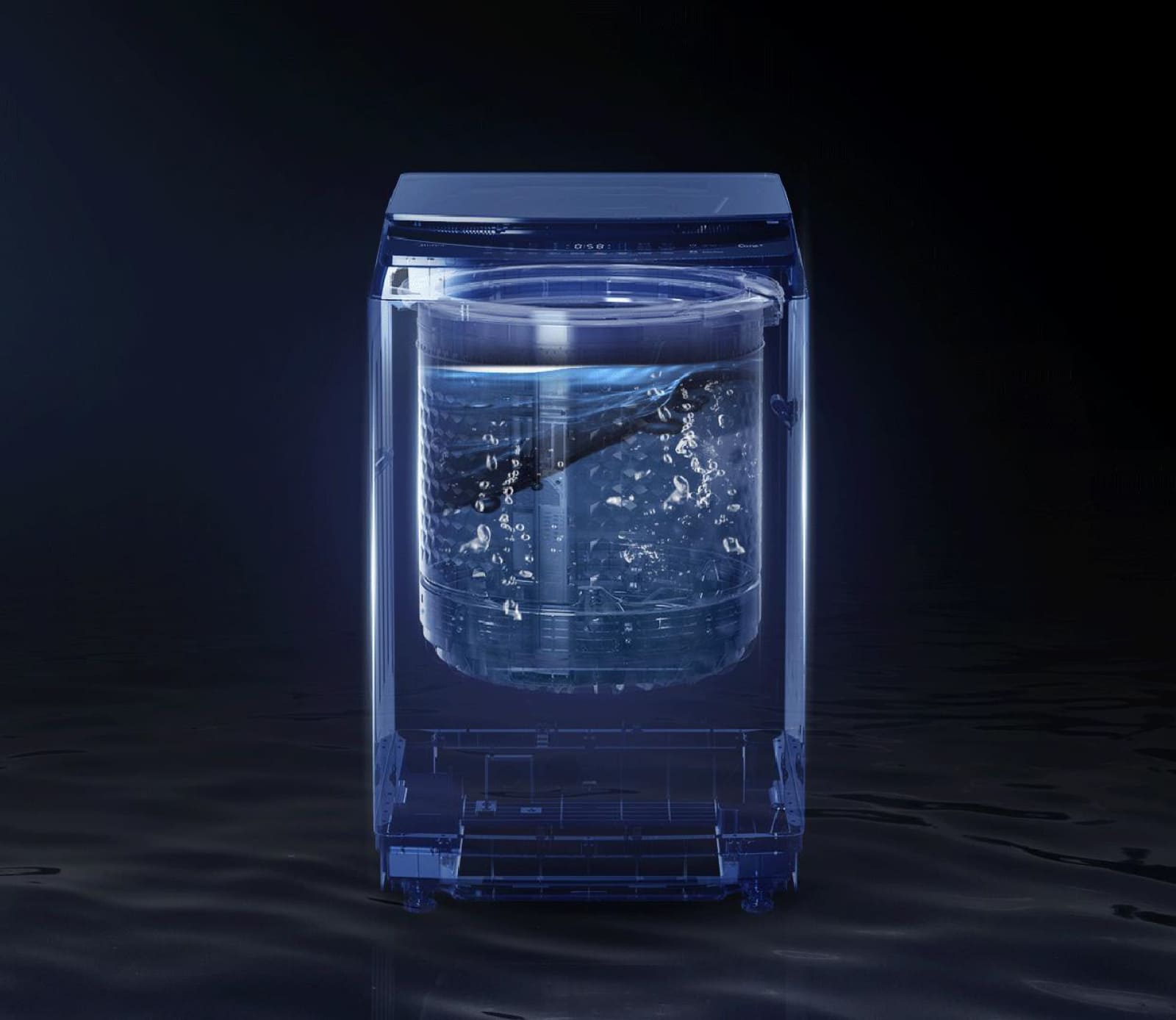
Elimina la a de manera efectiva y delicada
Imagina una limpieza profunda de 360° que abraza cada fibra de tus prendas, eliminando
la suciedad más obstinada mientras reduce al máximo el desgaste de tu ropa. Cada ciclo de lavado es como un
spa para tu ropa, garantizando un cuidado excepcional.

Prendas impecables y libres de olores
Olvida la sensación de ropa estancada o con olores residuales. Nuestra lavadora
incluye un sistema de ingreso de aire fresco que garantiza una ventilación integral durante el lavado. Tu ropa
estará más fresca que nunca.

Despídete de las pelusas y fibras indeseadas en tus prendas
No más tediosas tareas de limpieza del tambor o preocupaciones por las pelusas.
Nuestro filtro mágico actúa como un guardián invisible, evitando el retorno de fibras y manteniendo el entorno
de lavado siempre limpio y fresco.

Función limpieza de tina para mayor higiene
Con esta función, no solo estarás cuidando tus prendas, sino también el interior de la
lavadora. Elimina cualquier rastro de residuos, bacterias o malos olores de la tina, asegurando que cada
lavado sea una experiencia fresca y saludable.
Estética moderna con máxima funcionalidad
Diseñada para encajar perfectamente en cualquier espacio. Su diseño elegante y
contemporáneo se adapta a cualquier decoración, convirtiéndola en una pieza destacada de tu hogar.
La lavadora automática CW 5715 DG está diseñada para brindar eficiencia, cuidado y tecnología avanzada en el lavado de tu ropa. Con una capacidad de 15 kg, es ideal para familias o grandes volúmenes de lavado. Su sistema inteligente One Touch permite seleccionar el programa adecuado con solo un toque, facilitando el proceso y ahorrando tiempo.
Equipada con la innovadora función Anti-Tangle Assistant, minimiza los enredos en las prendas, garantizando un lavado más suave y preservando la calidad de los tejidos. Su tambor de acero inoxidable asegura mayor durabilidad y resistencia a la corrosión, mientras que su diseño moderno se adapta a cualquier espacio del hogar.
Descubre una experiencia de lavado avanzada que combina tecnología, comodidad y cuidado, perfecta para tus necesidades diarias.
Información adicional
| Garantía | Panel de control: 3 años Otros componentes: 1 año |
|---|---|
| Tensión Eléctrica (Voltios) | 120 |
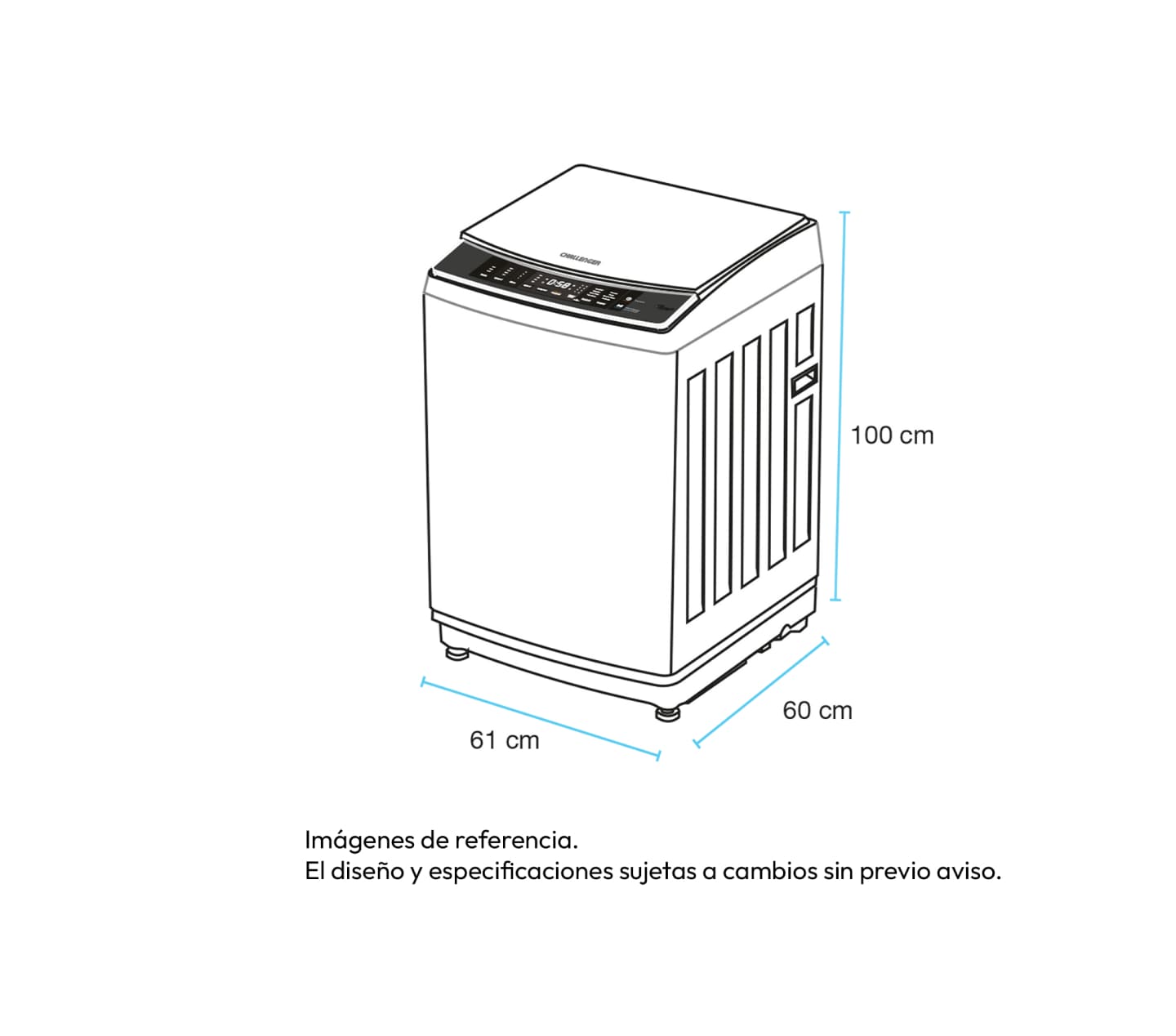
| Dimensiones del producto (cm) | 100 (alto) x 61 (ancho) x 60 (fondo) |
| Dimensiones de empaque (cm) | 104 (alto) x 65,5 (ancho) x 68,5 (fondo) |
| Peso flete (Kg) | 47 |
| Peso real (Kg) | 51 |
| Tipo de lavadora | Automática |
| Capacidad (Kilos) | 15 |
| Velocidad centrifugado (RPM) | 850/450 |
| Filtros | 1 |
| Tipo de carga | Superior |
| Potencia de Consumo (Watt) | 480 |
| Clasificación Energética | A |
| Cantidad de programas | 8 |
| Display | Sí |
| Motor | Convencional (Polea) |